Municipal GIS Dashboards for Manhole Sensor Data
A dashboard does not exist to show data. It exists to change one decision, and that decision is usually a funding decision.
Most sewer monitoring programmes collect rich sensor data and then present it as a wall of numbers nobody reads. The dashboard becomes a screensaver with a budget line, and the programme gets quietly defunded at the next cycle. The sensors worked. The reporting didn’t.
A municipal GIS dashboard is the layer that fixes this. It’s the single page that turns live manhole telemetry and asset data into the few numbers and the one map a decision-maker actually needs. Getting it right is a design discipline, not a widget choice.
By the end of this guide you’ll be able to design a dashboard your director will read. You’ll know which of the three audience views to build, how to choose the few KPIs that change a decision, how ArcGIS Dashboards compares with the open-source stack, the alert symbology that keeps everyone reading the same colour the same way, and the one page that wins the next budget. For the architecture that feeds the page, our field-to-map GIS integration guide covers how sensor data reaches the dashboard in the first place.
Building the reporting layer this quarter? Download the Dashboard KPI & Symbology Kit → It carries the KPI-to-audience matrix, the alert-symbology sheet and the one-page council summary template described below.
What a Municipal GIS Dashboard Actually Is
A municipal GIS dashboard is a single web page that turns live sensor telemetry and asset records into the few numbers and the one map a decision-maker needs. It joins three layers: an asset map, a live sensor feed, and a KPI layer that sits on top of both.
Those same three layers appear in almost every working deployment. The asset map holds the geometry and the identity. The sensor feed carries tilt, lid-open, water level, gas and battery state. The KPI layer reduces that stream to the handful of numbers a manager will act on.
The “GIS” part is not decoration, and this is where a GIS dashboard differs from a plain BI report. A KPI is only meaningful in place.
“Twelve alarms” means nothing. “Twelve alarms, three of them on the trunk main” is a decision. Geography becomes the first filter, so the reader sees not just how many, but where.
The connective principle across the whole page is “one asset, one view.” As Burgess & Niple describe it in their work on GIS dashboards, a good dashboard links each dataset directly to an individual asset, so selecting a single manhole surfaces its condition, media and spatial context in one place. Keep that principle and the page becomes negotiable between teams.
One Dashboard, Three Audiences
A dashboard fails when it tries to be one view for everyone. A director wants outcomes and money. A crew wants a live work queue. The public wants proof that the service works.
Those are three different questions, and they need three different views, refreshed at different rates.
The rule that prevents most failures is simple: one dashboard, three tabs. Three separate dashboards fragment the data and triple the maintenance burden. Three tabs on one data model keep every audience looking at the same truth.
| View | Audience | Question it answers | Refresh cadence | Typical element |
|---|---|---|---|---|
| Executive / sponsor | Directors, programme sponsors | Is the programme healthy and on plan? | Daily | KPI indicators with reference values |
| Operational | Crews, supervisors | What needs attention right now? | Real time | Live map, alarm list, work-queue state |
| Public / council | Residents, elected members | Is the service working and accountable? | Weekly or monthly | Coverage, incidents resolved, service levels |
The executive view is deliberately not real time. A director doesn’t need a live feed; they need today’s number against target. A daily refresh is enough, and it removes the temptation to watch a screen instead of reading a trend.
The operational view is the only one that earns the word “live”, and it’s the one crews act from. Keep it to the map and the current queue, because that’s what an operator can respond to in a shift.
The public view should never carry the raw alarm firehose. It reports monitoring coverage and incidents resolved, not every sensor that blinked. That restraint is what keeps the view credible to the people funding the work.
When the three views are defined separately, the shared data model does the heavy lifting. Highfields Municipal Authority learned this the hard way. The authority runs about 900 covers across a mid-sized city, with roughly 300 of them instrumented and reporting through ArcGIS Online.
Highfields’ first dashboard put every alarm on one screen, and its programme manager, Diane Okafor, liked it for a week. Then a single summer storm lit 40 devices at once and the map turned solid red.
Crews stopped opening it. A dashboard that shows everything communicates nothing, and Highfields’ had become the office screensaver nobody looked at. The fix was not new sensors. It was three views, six numbers, and a symbology rule that kept the baseline calm.
Choosing the KPIs That Actually Drive Decisions
The single most common reason a dashboard goes unread is KPI sprawl. A page with 30 indicators is read as zero, because the reader can’t tell which number matters. Six numbers that change a decision beat thirty that decorate a screen.
Run every candidate KPI through one test: does a different value change what someone does? If it doesn’t, it isn’t a KPI. It’s decoration, and decoration is what makes a dashboard expensive wallpaper.
| KPI | What it measures | Audience | Why it unlocks a decision |
|---|---|---|---|
| Monitoring coverage | % of covers instrumented | Executive | Sizes the next capital phase |
| Alarm response time | Alarm to crew arrival | Executive, operational | Shows service-level performance |
| Open-alarm backlog | Alarms still unresolved | Operational | Drives today’s dispatch |
| Overflow incidents avoided | Discharges prevented | Executive, council | Proves the programme pays back |
| First-time-fix rate | Jobs closed without a return visit | Operational | Exposes crew and data issues |
| Sensor availability | % of devices reporting on time | Operational, executive | Flags silent failures |
| Non-revenue water reduction | Water loss avoided | Executive | Quantifies the financial case |
The numbers behind those KPIs live in the asset attributes, which is why a dashboard is only as good as the manhole asset management GIS data model beneath it. If the attribute isn’t recorded against the asset, the KPI can’t be drawn from it.
The most powerful setting for a council audience is the reference value. Show this month’s number against target and against last year, never in isolation. A figure of 94% coverage means little on its own. “94% this quarter, against a 90% target, up from 71% last year” is a story a director can repeat.
That year-on-year comparison depends on history being stored and queryable, which is the job of a time-enabled feature layer for sensor data. The trend line is only as long as the archive behind it.
ArcGIS Dashboards vs Open-Source Alternatives
The platform choice is usually framed as a technology question. It’s really a maturity and budget question. Three paths are real, and the right one depends less on preference than on what the municipality already runs and can maintain.
Path one is Esri. ArcGIS Dashboards and Experience Builder sit on ArcGIS Online or ArcGIS Enterprise and are the fastest route for a team already inside the Esri ecosystem. Indicators, gauges, selectors and actions come out of the box, and the Esri ArcGIS Dashboards documentation is the reference for those mechanics.
Path two is open source. Apache Superset or Grafana handles the KPI layer, GeoServer and PostGIS serve the map, and a FIWARE context broker holds the shared data model. There’s no licence cost, but there is more build effort. Our QGIS, GeoServer and PostGIS guide for real-time sensor data walks through that stack.
Path three is a hybrid. If the municipality already owns an enterprise BI platform, bolting an embedded map element onto it is often the pragmatic first version.
| Platform | Stack | Best for | Typical effort | Watch-out |
|---|---|---|---|---|
| Esri | ArcGIS Dashboards / Experience Builder on Online or Enterprise | Teams already on ArcGIS | Low | Licence cost and vendor lock |
| Open source | Superset or Grafana + GeoServer/PostGIS + FIWARE | Budget-constrained municipalities | High | Needs an in-house maintainer |
| Hybrid / BI bolt-on | Existing Power BI or Superset + embedded map | Organisations that already own BI | Medium | Map interactivity is often shallow |
The decision rule in three lines: a mature Esri geodatabase points to path one. A small team with no enterprise licence points to path two. An organisation that already pays for a BI platform and wants a first version points to path three.
The open-source path is where FIWARE and its NGSI-LD context model matter most, because a standards-based data layer is what lets a dashboard survive a vendor change later. A stack you can swap a component out of is worth more than one you can’t.
Not sure which path fits your stack? Talk to our application engineers → and we’ll walk the three options against your current GIS and BI estate.
Designing Alert Symbology That Everyone Reads the Same Way
Symbology is a governance decision, not a styling preference. When a crew, a supervisor and a councillor all read the same colour the same way, the map becomes a shared language. When they don’t, the map becomes an argument.
Manhole monitoring has four alarm states, not three. Normal, warning, critical, and the one everybody forgets: data-stale, the state of a device that has gone silent.
| Alarm state | Colour | Icon / shape | What it triggers |
|---|---|---|---|
| Normal | Green or neutral | Small dot | Nothing; the baseline state |
| Warning | Amber | Triangle | Queue for review, no dispatch |
| Critical | Red | Filled marker with halo | Automatic dispatch and escalation |
| Data-stale | Grey, hatched | Hollow marker | Sensor-health work order, not a field callout |
Two conventions keep the map readable. Keep the baseline calm, because if every cover is red by default then red stops meaning anything. And cluster markers at low zoom, so a district view shows counts while individual assets appear only when the operator zooms in.
The data-stale state is the one that protects credibility. A dead sensor must never inherit the normal colour, because a dashboard that hides a silent device is lying by omission. It’s the same principle that keeps one dead battery from being an emergency: the state triggers a health check, not a crew callout.
From Dashboard to Funding: The Council Presentation
This is why the dashboard exists. The screen the director forwards upward is not the operations view. It’s one page: coverage, incidents resolved, response-time trend, spend against plan, and what happens without further investment.
Frame it in the language city finance already uses. Split capital from operations and maintenance, show a multi-year forecast rather than a single-year request, and lead with cost per incident avoided. The manhole monitoring ROI case makes the same argument from the cost side, connecting avoided overflows to the business case for instrumenting a network.
Transparency is a tactic here, not a burden. A bounded public view, one that shows coverage and service levels without exposing raw alarm data, builds the political capital that funds the next phase. Elected members fund what they can see working.
The scale is not hypothetical. A documented municipal stormwater plan put its 25-year total capital requirement at roughly 6.15millionin2024dollars,near6.15millionin2024dollars,near285,000 a year. Monroe, Ohio, population around 15,412, uses ArcGIS dashboards to prioritise preventive maintenance across about 2,500 catch basins, moving from reactive to planned work.
Six months after trimming its dashboard to six KPIs and three views, Highfields took a single page to its council. Coverage was up from 71% to 94%, median response time had fallen to just under four hours, and fourteen overflows had been avoided across the season.
The phase-two funding passed on that page. The sensors had produced the same data a year earlier. What changed was that the director finally had something to read.
The one-slide summary is the three numbers a council remembers: coverage, incidents prevented, and response time. Everything else belongs in the appendix.
Five Failure Modes to Design Out
Every failed municipal dashboard fails in one of five ways, and each is a design decision rather than bad luck.
- KPI sprawl. “We’ll show everything” produces a page nobody opens. Six numbers beat thirty.
- Alarm fatigue. Using critical colour for non-critical states trains readers to ignore red, and the funding evidence goes with it.
- Stale-data trust collapse. One dashboard showing yesterday’s numbers loses the room permanently. Freshness has to be visible.
- Latency mismatch. A “real-time” operational view built on a batch feed is a promise the plumbing can’t keep.
- Data nobody trusts. A KPI sitting on an unverified sensor stream is a number waiting to be questioned.
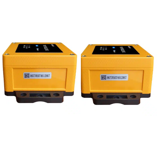
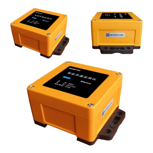
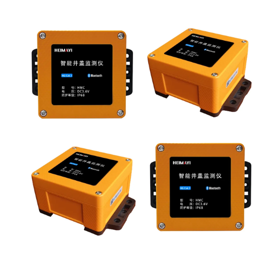
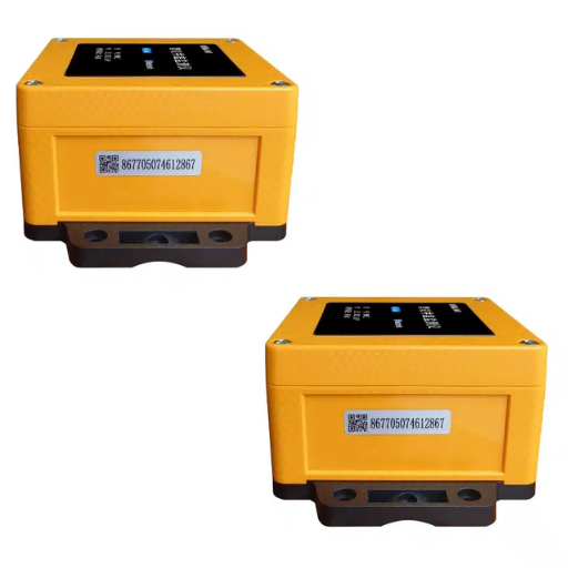
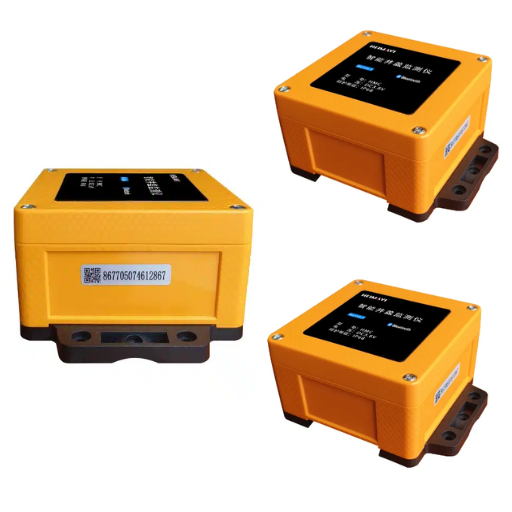
The last failure is the one hardware fixes. The Smart Manhole Cover reports tilt, lid-open, water level, gas and battery state, and its payload carries the asset identity every KPI depends on. A dashboard is only as trustworthy as the device standing behind the number.
Conclusion: The One Page That Wins the Budget
A municipal GIS dashboard is not a technical artefact. It’s the instrument a programme uses to stay funded, and its success is measured in decisions changed rather than data displayed.
- One dashboard, three audiences: executive for outcomes, operational for action, public for trust.
- Six KPIs that change decisions beat thirty that decorate a screen.
- Choose the platform by maturity and budget: Esri inside the ecosystem, open source when there’s no licence to spend, hybrid as a first version.
- Design four alarm states, including data-stale, so everyone reads the same colour the same way.
- Walk into the council with one page: coverage, incidents prevented, response time.
Start with two moves this quarter. Trim the dashboard to the KPIs that change a decision, and confirm that a silent device shows as stale rather than normal. Those two fix most of the failure modes above.
Download the Dashboard KPI & Symbology Kit for the KPI-to-audience matrix, the alert-symbology sheet and the one-page council summary template. The devices that populate every KPI on it are the ones we build: the Smart Manhole Cover reports the field condition, and the IoT Data Collection Terminal aggregates and classifies events before they reach your dashboard. Read the full field-to-map GIS integration guide for the architecture around them, or talk to our application engineers about designing the reporting layer for your network. To gain a deeper understanding of GIS CMMS work order integration, please refer to our accompanying guide.