Time Enabled Feature Layer Sensor Data: Visualizing Manhole History
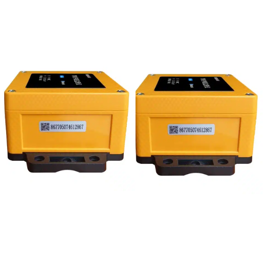
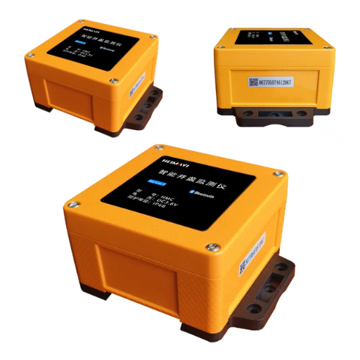
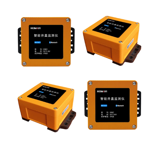
Elena Marchetti has thirty days of network history and nothing to show for it. Four hundred smart manhole covers across her district have reported tilt, gas and water level since August, and the observations sit in a table with a timestamp column, exactly where they should be. But the map she presents to the council on Thursday shows only today’s alarms, and when a councillor asks what happened during the storm on the 14th, the honest answer is that the system recorded everything and the map can’t show any of it.
That gap isn’t a data problem. It’s a time-enabled feature layer problem, and it’s usually created by decisions about time fields and storage made long before anyone opened an ArcGIS time slider.
What’s missing is the step that turns timestamped observations into an animation explaining a month of network behaviour in forty seconds. This guide covers what a time-enabled feature layer is, which time model your sensor data needs, how to keep the slider usable at municipal volumes, and the storage decisions that must be settled first. For the wider architecture, our field-to-map GIS integration guide covers the chain from cover to map.
What Is a Time-Enabled Feature Layer?

A time-enabled feature layer is a GIS layer whose features carry a time field, or a start and end field, that the map reads to place each feature on a timeline. With time enabled, the layer can be filtered to a specific moment or interval and animated with a time slider, so stored observations replay in sequence.
That definition is the whole mechanism. It’s harder to satisfy than it sounds.
The three things every time-enabled layer must have
Every layer that animates needs the same three ingredients. Miss one and the slider does nothing.
- A time field. A Date or Date only field holding when the observation happened. Two fields if a feature represents a span.
- A time model. Whether each feature is a moment in time or a range with a duration.
- A time extent. The earliest and latest timestamps in the data, which becomes the slider’s total range.
Why a timestamp column is not enough
A timestamp in a database is only a value. It drives a slider only when it sits in a field of the correct type and is registered in the layer’s time settings. Held as text, or as a number such as 20260930, it won’t work even though it looks right in a table view.
A gas excursion logged at 03:07 is a moment. A cover displacement beginning at 02:14 lasted four hours. Those two facts need different storage.
Which Time Model Does Your Sensor Data Need?
The time model is the decision that most often forces a rebuild, because changing it later means recreating the layer. Two models exist, and one display setting is routinely confused with a third.
Instant: one timestamp per event
A time instant model gives every feature a single time field. Each observation is a point on the timeline and exists for zero duration, which is the default for report-by-exception telemetry: a cover reports when it’s tilted, when gas crosses a threshold, when water reaches a level. An ArcGIS time aware layer’s time type is instant.
Interval: start and end fields
A time range model gives every feature two time fields, and the feature exists for the duration between them. Both fields must be the same field type. Use it when the duration is itself the measurement: how long a cover stayed displaced, how long gas concentration stayed above the alarm threshold.
Cumulative vs current interval: a display choice, not a data choice
Cumulative and current-interval display use exactly the same stored data and differ only in what the ArcGIS time slider shows at each step. Current interval shows what happened inside the current window, giving clean frames and occasional blanks. Cumulative shows everything from the start of the extent up to the current step, showing how a situation built up.
| Time model | Sensor example | Question it answers | What it costs |
|---|---|---|---|
| Instant (one time field) | Gas excursion logged when concentration crosses the alarm threshold | When did it happen, and where? | Smallest storage footprint; sparse events mean a quiet slider |
| Interval (start and end) | Cover displaced from 02:14 to 06:40 | How long did it last? | Twice the time columns; duration queries become trivial |
| Cumulative display | 30 days of tilt events replayed forward | How did the situation build? | Every frame carries all prior features |
| Current interval | 30 days of water level, one hour per step | What was happening at this moment? | Cleaner frames, but a missed report leaves a blank step |
How to Enable Time on a Feature Layer, Step by Step

Here’s the sequence, in the order that avoids rework.
- Confirm the layer has a Date or Date only field. If timestamps are text or numeric, convert them into a real time field first.
- Open the layer’s time settings. In ArcGIS Online this sits on the layer’s item page under Time Settings; in ArcGIS Pro it’s on the layer properties.
- Choose the time model. One field for an instant, or a start and end field for a range.
- Set the time extent, from the data or explicitly, so the slider has a defined total range.
- Choose the step interval. Either the length of one interval, or the total time divided into equal steps.
- Choose the display behaviour. Current interval for a clean per-step view, cumulative to show accumulation.
- Verify against a known event. Pick an incident you can date and confirm it appears in the frame it should.
The field-type rules that block it
The field must be Date or Date only. For a range model, both the start and end fields must be the same field type. Nothing else is accepted, and nothing in the data itself signals that a problem exists.
When the option is not there at all
Two failure classes look identical from the outside.
The first is a missing Date field. If the table has no date column, the Time Settings option is not available, and the fix is to add and populate a Date field rather than hunt for a setting you’re not seeing. The Esri guide to configuring time settings is the reference for the field rules and the available models.
The second is a genuine defect. Enabling time on a feature layer associated with a scene layer has been recorded as failing, with a workaround of setting a time filter in ArcGIS Pro before publishing. Bug records change, so treat the class as the durable lesson: when the control is missing, check the field type first, then check whether the layer is bound to another layer type.
If your layer is built on a related observation table rather than a flat file, the manhole asset data model guide shows how the time field and the join key fit together.
Irregular Sensor Timestamps: The Problem No Tutorial Mentions
Every tutorial begins with a tidy hourly series. Real telemetry isn’t tidy.
Why report-by-exception data is not an hourly grid
Daniel Whitfield found this out the week before a regulator visit. His covers were configured to report on exception, which is right for battery life: the device stays quiet until something changes. The result was three hundred readings packed into a two-hour storm, then eleven days of silence.
With hourly steps most frames were empty; with daily steps the storm became a single frame. Neither setting was wrong. The data wasn’t shaped like the grid the interface assumed.
Binning, and the two tools that fix a sparse series
The answer is binning: deciding deliberately what one step of the animation represents, then aggregating raw events into those bins. For an incident review, an hourly bin is usually right. For a seasonal trend, it’s a day.
Two tools exist for the messy end of this. Convert Time Field turns a string or numeric column into a proper time field. Calculate End Time sets each feature’s end time to the next feature’s start time, turning a sparse series into a continuous animation instead of one where features appear and vanish.
The publish interval your devices are configured for is the resolution ceiling downstream. A smart manhole cover reporting every fifteen minutes during an event can’t produce a smoother animation later, and an IoT Data Collection Terminal aggregating several covers on one radio can only forward what it was given. Bin coarser than the device reports if storage demands it. Never finer.
The local-time and daylight saving trap
The quietest failure in this workflow is a device-local timestamp. In a single-region deployment it rarely surfaces. Across time zones, or in a country that observes daylight saving, it produces a timeline that is subtly wrong in a way nobody can see on a map.
Daylight saving creates two defects. When clocks spring forward, an hour never occurs, so an event logged after the shift can sort before events that happened earlier. When clocks fall back, an hour occurs twice, so two observations carry the same local timestamp. The remedy is to store UTC and treat local time as a display concern, the same discipline that coordinate metadata that fails silently demands for position.
Storing Sensor History So the Time Slider Actually Works

Here the visualisation question becomes a database question.
The volume wall, with the arithmetic
A single cover reporting 24 readings a day produces 8,760 rows a year. Scale that up: 100 covers is 876,000 rows a year, 1,000 covers is 8.76 million, and 10,000 covers is 87.6 million rows a year. Run the multiplication for your own district: the number is the argument.
Ravi Menon hit this wall on a 6,000-cover deployment when he left cumulative display on across a 90-day extent. The animation ran, then slowed, then stopped responding, because by the final frames the browser was holding most of the period on screen at once. The data was correct; the display choices weren’t.
Bin on ingest, roll up in the database, or cache the tiles
Three answers are legitimate; one isn’t.
Bin on ingest. Aggregate raw events into hourly or daily rows as they arrive for signals that don’t need event fidelity. This belongs in the pipeline, and binning observations in the middleware bridge is where it fits. For signals that do need fidelity, an edge data acquisition computer can retain the raw burst locally and publish both the events and a pre-aggregated summary.
Roll up in the database. Keep the raw series in one table and maintain a continuous aggregate or materialised view at the granularity the slider steps in. One published benchmark of time-series layouts found the wrong layout costs working hours, not just disk: a workload completing in 27 minutes without partitioning took 4.3 hours with indexes maintained across hundreds of daily chunks. The layout must match the query pattern, and the open-source GIS stack for live sensor data covers the PostGIS side of that choice.
Cache the tiles. Each distinct time range requested becomes its own cached tile variant, so stepping the slider serves cached tiles instead of re-rendering.
The illegitimate answer is hoping the slider gets faster with more history.
Which signals deserve event fidelity
Deciding this per signal is what makes the storage plan concrete.
| Signal | Fidelity needed | Storage pattern | Retention |
|---|---|---|---|
| Water level | Event, peak preserved | Raw where a threshold is crossed; hourly rollup otherwise | Raw 12 months, rollup 5 years |
| Gas concentration | Event, full excursion | Raw at the device report interval | Raw 24 months |
| Cover tilt | Event, sparse | Raw events only | Raw 24 months |
| Battery voltage | Trend only | Daily rollup | Rollup indefinitely |
| Signal strength | Trend only | Daily rollup | Rollup indefinitely |
Water level and gas are incident-driven, so they carry the storage cost. Tilt is sparsely eventful and cheap. Battery and signal strength are diagnostic.
Time-Enabled Layers Beyond Esri: QGIS, GeoServer and SuperMap
Much municipal GIS work outside North America runs on non-Esri stacks, where the temporal tooling is mature.
QGIS Temporal Controller and the “Accumulate” option
QGIS drives animation through the Temporal Controller, which advances a map through a defined time range and applies that range to every layer with temporal properties enabled. Its Accumulate option is the equivalent of cumulative display: features from earlier frames stay visible as the animation advances. One warning is worth carrying from the cartographic literature: when a temporal tool interpolates between known timestamps to produce smooth motion, the interpolated values aren’t real data. Animate what was measured.
WMS-T: the standard TIME= parameter
The interoperable mechanism is the WMS time dimension, usually called WMS-T. A layer is published with a time dimension driven by a time column, and the client requests a step with a TIME= parameter. QGIS treats a time-enabled WMS or WMTS layer as dynamic temporal control set to automatic by default, so it follows the Temporal Controller. The QGIS user manual covers the controller and the layer-side settings.
Two caveats come with it. Temporal WMS settings are hidden on the layer’s Source tab, which is why people conclude the capability is missing. And a request may send only the frame’s start time, which is fine for a layer whose features share a timestamp and wrong for a point layer where each carries its own.
| Platform | How time is enabled | Animation mechanism | Caveat |
|---|---|---|---|
| ArcGIS Online and Pro | A Date field, then Time Settings on the layer | Time slider with instant, current-interval or cumulative display | Unavailable without a Date field; a defect blocks layers associated with a scene layer |
| QGIS with GeoServer | A time column in the source table, published as a WMS time dimension | Temporal Controller driving automatic dynamic temporal control | Temporal settings are hidden on the Source tab; requests may send only the frame start time |
| SuperMap iServer | Time fields on the dataset, exposed through the temporal service | Client-side timeline control | Fewer published worked examples than the Esri stack |
| Open-source web maps | A time configuration object on the layer, or a WMS TIME= parameter |
A timeline widget driven by a time-change event | You build the interface, including its performance limits |
The right answer is the one your GIS team already supports.
From Animation to Analysis: Where the Space Time Cube Fits
Once the history animates, the next question is whether anything in it is statistically real. Emerging Hot Spot Analysis aggregates observations into a space-time cube, tests each bin and location, and classifies the result into one of seventeen patterns. Most municipal programmes don’t need it, and chasing it before the ArcGIS time slider works is one of the ways a programme stalls. The nearer-term win is incident detection on a time-instant layer, covered in the streaming telemetry integration guide, and the Emerging Hot Spot Analysis reference documents the method.
Before You Enable Time: A Pre-Flight Checklist

These six checks belong before configuration, not after a failed demo.
- Audit the time field type in the source, not in the map. Confirm it is Date or Date only, and confirm the timezone it was written in.
- Decide the time model per signal group. Instant for report-by-exception events, interval where duration is the measurement.
- Choose the bin size and write it down. One step of the animation equals one bin, and the bin belongs upstream of the slider.
- Confirm the device publish interval against the bin size. The device sets the resolution ceiling, so binning must be the coarser of the two.
- Decide retention per signal. Event-fidelity signals keep raw history; trend-only signals keep rollups.
- Verify one dated incident end to end. Pick an event with a known date and confirm it appears in the correct frame before anyone else sees the layer.
If you take one thing from this article, take the sixth. A single verified event proves the whole chain.
Conclusion
Turning stored sensor history into an animation isn’t a cartography problem. It’s a decision chain, and the load-bearing decisions sit before the slider.
- A time-enabled feature layer needs a time field, a time model and a time extent. A timestamp column alone satisfies none of them.
- Instant and interval change how data is stored. Cumulative is only a display choice, and it’s the usual cause of a stalling slider.
- Report-by-exception telemetry is irregular by design, so the bin size is a deliberate decision rather than a default.
- Ten thousand covers at 24 readings a day is 87.6 million rows a year, which is why binning, rollups and tile caching aren’t optional refinements.
- Store UTC, verify one dated event, and confirm the signal’s publish interval before promising anyone an animation.
Start with the pre-flight checklist, then confirm what your field devices actually publish, because that interval bounds everything downstream. Black Ant’s smart manhole covers, IoT data collection terminals and edge acquisition hardware publish documented telemetry with the timestamp in the payload, so the resolution ceiling is a specification you can read. Read the full field-to-map GIS integration guide for the architecture around it, or talk to our application engineers about the temporal requirements of your project.